COLOUR IDEAS
In our book, Moon and Turtle, we briefly talked about how colour can really change the look and feel of a garment. Colour is very personal, and there really is no wrong combination (no matter what others might tell you). Still, a lot of people struggle with choosing colour and need a little guidance, and that’s perfectly okay! On this page we look at the designs, Kinsan, Kordy, and Zener, and offer some colour combinations and tips to hopefully inspire, and get you started on the path of choosing amazing colour combinations.
KINSAN STRIPE PATTERNS
The Kinsan raglan sweater is the kind of pattern that is essentially a blank canvas that’s waiting for you to plug in your own unique colour and stripe pattern. In Moon and Turtle, we offered some additional stripe sequences aside from the ones pictured in the samples above. Have a closer look at these swatches, and perhaps a completely new stripe pattern and colour combination will spark! Of course, feel free to use any of these below. The charts for these swatches can be found on the pages of Moon and Turtle.
We used Briggs & Little Sport for our swatches. This yarn comes in so many colours, the colour possibilities are literally infinite! Don’t feel restricted to stick with one yarn brand though. Using a combo of yarns in the same or similar gauge but of different fibre types and textures could yield some pretty fascinating results. Swatch away, and see what you come up with.
Swatch #1
A - Bleached White
B - Pink
C - Gold
Swatch #2
A - Grey Heather
B - Washed White
C - Peacock
Swatch #3
A - Fawn
B - Green Heather
C - Mauve
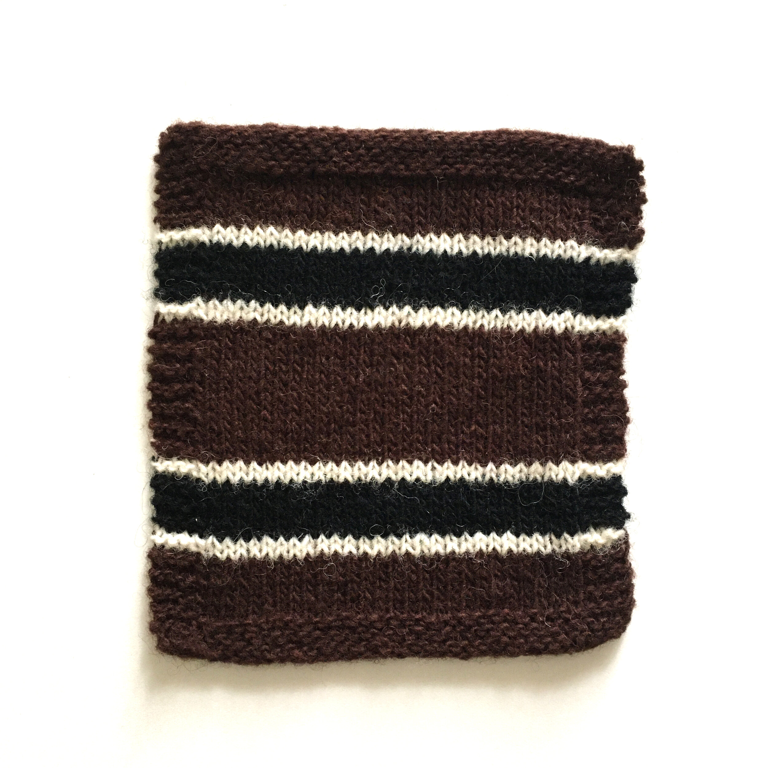
Swatch #5
A - Brown
B - Black
C - Natural White
Swatch #7
A - Gold
B - Navy Blue
C - Scarlet
Swatch #4
A - Sheeps Grey
B - Navy Blue
C - Light Blue
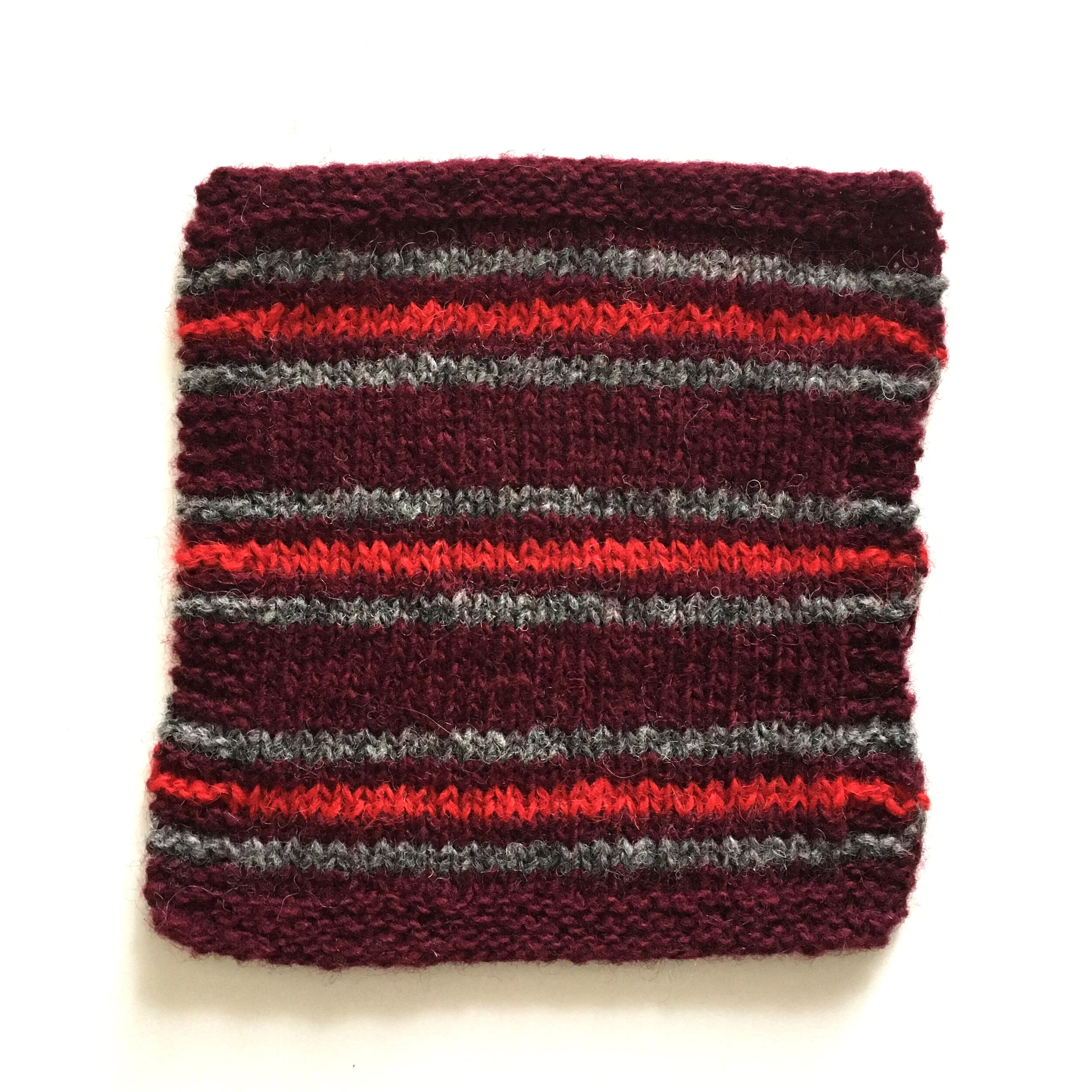
Swatch #6
A - Dark Maroon
B - Medium Grey
C - Scarlet
Bonus Swatch! (not in book)
A - Light Grey
B - Brown
C - Dark Maroon
For the samples in the book and for the swatches pictured on this page, we used a combination of 3 colours. However, you can use as many or as few colours as you want! This green sample pictured above on Oliver (Kiyomi’s husband, and the photographer for Moon and Turtle) used 4 colours.
A - Green Heather
B - Sheeps Grey
C - Dark Grey
“D” - Bleached White
Oliver’s Kinsan is knit in size 4, with approx 15cm / 6” of positive ease.
The chart is available here, if you want it…
KORDY YOKE COLOURS
In our book we mention the importance of contrast when deciding on colour combinations for the yoke of the Kordy sweater.
Contrast is important, but there are different ways of using it, and of course a lot comes down to personal preference in the end. Any colour combo that speaks to you will work, however for the sake of this post, we used colours that contrast from each other, either by being light and dark, or being opposites on the colour wheel. We also used white as one of the colours for all of our swatches, because we liked how it really highlighted the other colours being used.
Another thing we like to play with is chroma. Chroma refers to the intensity of a colour, as in how saturated / pure it is. The more grey or muted a colour is, the lower its chroma is. Pairing low chromatic colours with high chromatic colours is a fun way of using contrast too.
The two swatches above are good examples of how chroma works. The right side of each swatch has been turned to grayscale.
The swatch on the left would be considered high chroma. Even though most of the colours fall into the same colour category of greens and blues, the combination of dark, bright and light contrast really nicely with each other because each colour has a different intensity. The pattern can still be read fairly clearly when the the swatch is turned to grayscale. Choosing colours of different intensities will create a bold and very clear pattern.
The swatch on the right is what is considered a combo of low chroma colours (not so bright or vivid), even though the colours used contrast from each other. The pinkish colour sits approximately opposite the teal green on the colour wheel, however they are both of the same intensity. When the swatch is turned to grayscale, the colours almost all read as the same shade of grey. Choosing colours of similar intensities will create a more quiet and soft pattern.
Neither are wrong and both look great! Choose what works for you, and experiment! There are many many variations to be explored. Here are two more swatch colour combinations using high and low chroma knit in Peace Fleece Worsted.
Swatch #1
Yarn A - Sheplova Mushroom
Yarn B - Brownie
Yarn C - Negotiation Grey
Yarn D - Antarctic White
Swatch #2
Yarn A - Zarya Fog
Yarn B - Antarctic White
Yarn C - Palomino
Yarn D - Fathers Grey
CHANGING COLOUR POSITION
Hand dyed sock yarns often come in 100g skeins (although many dyers have started making those adorable mini skeins), and after knitting a pair of colourwork socks you might find that you have a lot of leftover yarn. Why not use that yarn to make a second pair of socks, but with the colours reversed?! Changing the colour position can make an item look completely different and have some unexpected while pleasing results. The swatches below demonstrate this with the pattern for the Zener socks using Akara Yarns. You can also do this with any leftovers from the ESP toque!
Yarn A: Snowy Owl (not nougat as in book!)
Yarn B: Seashore Seashells (not Willow as in the book)
Yarn C: Honey Bear
Yarn A: Incense
Yarn B: Toasted Marshmallow
Yarn C: Rose Gold
In these swatches we added an extra row of the diamond motif. This is something you can try out on your Zener socks too for an extra colour pop! Just remember to keep your floats loose to maintain a nice elastic sock.
If you’re still unsure of how to choose colour for a knitting project, using what you have on hand is always a great option. Take a stash dive!


